
Step 3: Research - Competitive Comparison
At first glance, the Romp & Roam website seemed a little difficult to navigate. Her products were categorized according to pattern “collections” (i.e. summer florals, outdoors, fruits, etc.). It looked like Brittany sensed her customers might be having some trouble looking through her merchandise. In April, she had posted a step-by-step guide on how to use her website to her Facebook page.

I decided it would be helpful to look at other shops selling similar merchandise to see how they were organized. I looked at two companies that sell children’s clothing - Maisonette and Colored Organics. I also wanted to look at CrewLala, a shopify store that specializes in pet accessories but (similar to Romp & Roam) is big on their pattern collections. To compare the user experience of each of these websites, I created user flows that would take me through each shop’s buying process.

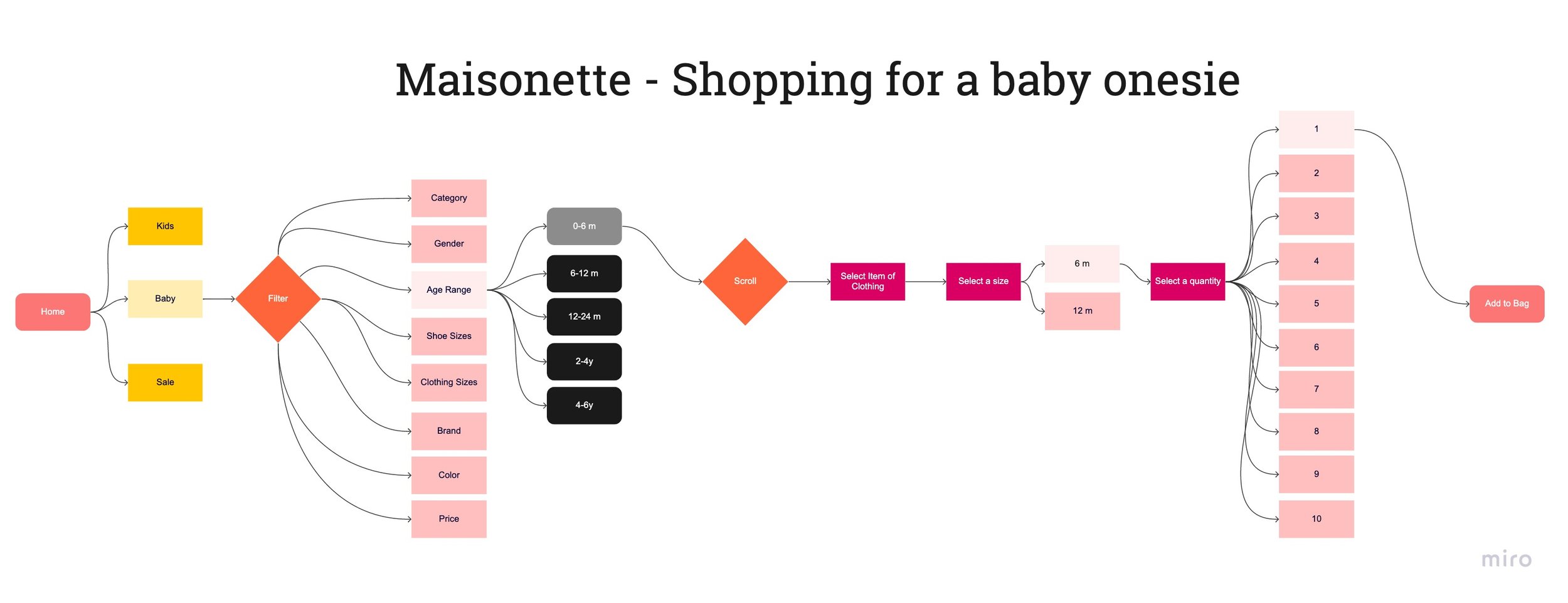


Compared to Romp & Roam, Maisonette and Colored Organics had a lot fewer menu categories. I believe this made the process of finding what I was shopping for easier. Both shops utilized a hierarchy that categorized clothes by age first, then followed by clothing type. Pattern/color selection were reserved for the end. This seemed to be a more natural flow than Romp & Roam.
Even Crew Lala - a store that celebrates their pattern collections - places item type above pattern in their information architecture.